The problem
Following an accessibility audit, we’d identified ways the Barbican Centre website could — and should — be more accessible.
The timeline
January to March 2021.
The team
Project team
- 1 Front-End Developer
- 1 Back-End Developer
- 1 Head of Systems
- 1 Tester
- 1 Marketing Manager/Product Owner
- 1 UX Designer/User Researcher (me)
The process
Barbican brand
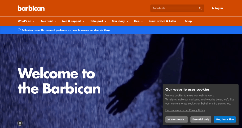
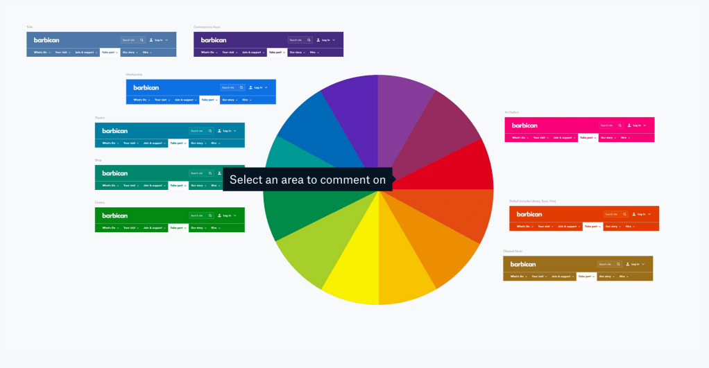
The Barbican Centre uses distinct colours for each of its artforms, e.g. cinema, theatre, and contemporary music. This means that as people move around the website, the colour palette changes to give a visual indication of where they are.
For example the main brand colour used for the homepage is a vibrant orange, while art and design-related content have a hot pink masthead and accent colour.
Accessibility issues
As a team we undertook accessibility training and completed a site-wide audit, which flagged some issues.
We learned that not all of the artform colours met WCAG international standards because the colour contrast was not high enough. This meant that some users, particularly those with visual impairments like colour vision deficiency, might struggle to use our website.
We also discovered that some components on our homepage did not follow best practice guidelines, such as a large hero video which auto-played when the site loaded.
Agreeing scope and priorities
Our biggest challenges were:
- Improving colour contrast to make text accessible
- Keeping the colours for each artform roughly the same as they already were (because of brand recognition and to continue aligning with designs in print)
- Collaborating with each department to ensure they were happy with their altered colours
- Getting approval to change the main ‘Barbican orange’ to a slightly darker shade, so that it was WCAG Level AAA compliant
- Maintaining a harmonious colour palette while considering all the above
Collaborating
As a team we went back and forth mocking-up several options, testing each colour and colour combinations with tools such as WebAIM’s Contrast Checker. This continued until we found colours that all met Level AAA while working well together.
Once we were confident we had strong options for a palette, stakeholders (the owners of each artform) were looped in so that we could all discuss why we’d arrived at the proposed solution and get sign-off for implementation.
Summary
I’m particularly proud of how we worked with stakeholders to create a colour palette that’s now accessible to all users, while remaining true to each artform and the Barbican Centre brand. Everyone got behind accessibility as a priority which made the process smooth and efficient, resulting in a quick resolution.
There was some concern that users might comment on the site looking different, and not in a positive way, but we received no feedback on this. We took this as a good sign that users either hadn’t noticed or did not care about the change of colours. Our changes were subtle so this was exactly what we wanted.
Alongside this work, we also added a pause button on the video hero so that users had control over it. This now meets WCAG SC 2.2.2 Pause, Stop, Hide.
What else have I done?
See more of my work, including Cancer Research UK’s Race for Life app and improving ways of working at Bupa.
