The problem
Membership is a main source of reliable income for the Barbican Centre, Europe’s largest performing arts centre. Our goal was to better promote it to users and encourage more people to become members.
We also wanted to help existing members to better understand their benefits and how to make the most of them.
The timeline
February to March 2020.
The team
Project team
- 1 Front-End Developer
- 1 Back-End Developer
- 1 Head of Systems
- 1 Tester
- 1 Marketing Manager/Product Owner
- 1 UX Designer/User Researcher (me)
The process
Discovery
I conducted thorough competitor analysis, analysing how similar establishments promoted their memberships and their associated benefits.
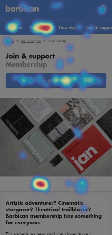
I also used tools like Google Analytics and Hotjar to see how our users interacted with existing membership pages, including how they navigated to and around them and what their onward journeys looked like.
Alongside this, I facilitated a user journey mapping session involving expert stakeholders from across the Barbican Centre. This helped us to better understand the existing journey, as well as to make assumptions about users’ motivations and frustrations.
Ideation
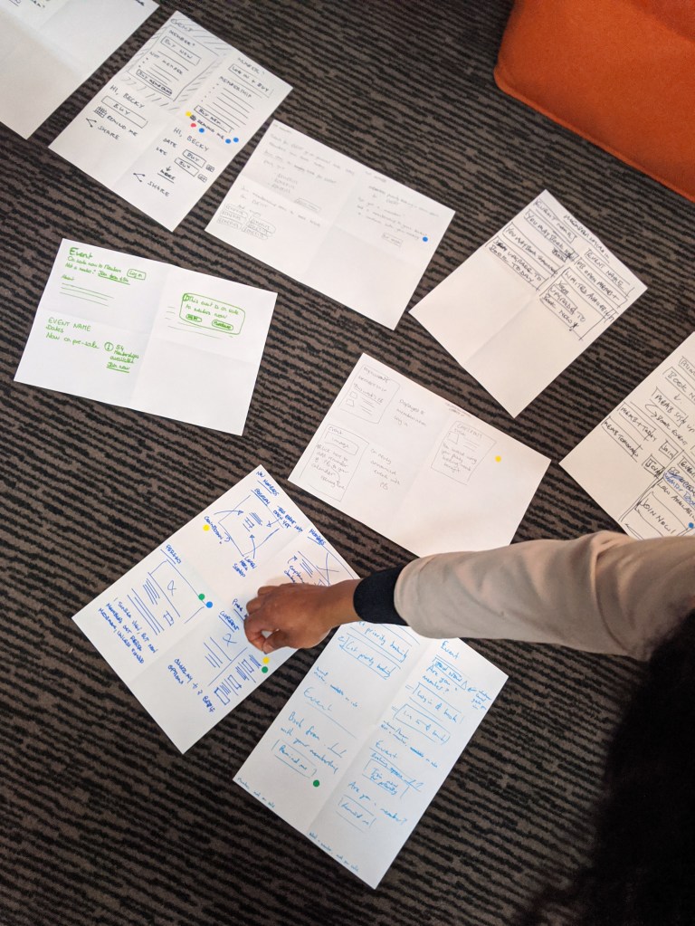
After gathering this initial knowledge, I lead a team ideation workshop to generate solutions together.
We used the Crazy 8s method to sketch lots of ideas, and after presenting our individual thoughts back to the group we dot-voted on which components we liked best from each other’s designs.
Co-designing with people from a variety of roles, including developers, allowed us to rapidly pull together ideas that were technically feasible as well as user-centred.
Wireframing
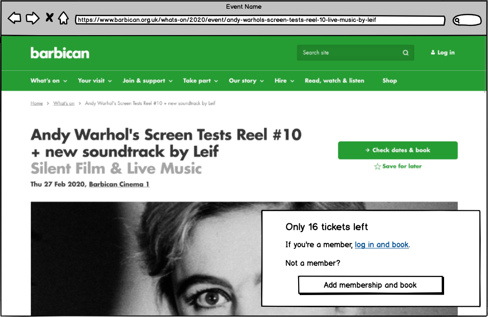
Next, I used Balsamiq to create wireframes which collated all of our favourite elements into several potential design options. Our strongest ideas revolved around the concepts of social proof and/or scarity bias.
We also wanted to promote benefits of membership, the main one being priority booking for events. So our ideas involved displaying this more prominently, nudging users to add a membership to their basket so they could then add tickets. (A secondary call-to-action prompted existing members to log in and made this easy for them to do.)
We also improved the membership landing page, drastically reducing content as it was clear from scrollmaps and heatmaps that users weren’t engaging with most of it. It was adding nothing to their experience and distracted from what was valuable to them and to us.
Iterating
To gather real user feedback on our ideas, I sent a survey to our User Panel (bearing in mind that these people were actively engaged enough with the Barbican that they’d volunteered to help with regular research).
We used these insights to inform and refine final designs prior to prototyping and development. It also helped us to understand how to better talk about the benefits of membership to make it most appealing to those considering it.
Summary
During the course of this work, COVID-19 was characterised as a pandemic and the world went into lockdown. This meant my planned research had to pivot, as I became limited to data analysis and desk research, and our team’s priorities changed.
Using Google Analytics and Hotjar, I monitored engagement with the new pages so continuous improvements could be made. These tools also helped me understand that our changes had made the experience better for users, while also driving more memberships for the Barbican Centre.
What else have I done?
See more of my work, including launching The Great British Bake Off for Stand Up To Cancer and improving ways of working at Citizens Advice.
