The problem
Bupa’s Get Treatment hub made it difficult for users to understand their healthcare options. The pages and each of their onward journeys caused confusion and complication, delaying people from getting the treatment they needed.
In scope for improvement was the Get Treatment landing page and its child pages, such as Cancer Concerns and Mental Health Symptoms.
The timeline
March to June 2023.
Shipped in October 2023.
The team
Project team
- 1 Senior Content Designer
- 1 UI Designer
Stakeholders
- 1 Senior Business Analyst
- 1 Product Owner
- 1 Delivery Manager
- Brand team
- Multiple Heads Of, owners of each child page
UX process
Research
We understood there to be a tight turnaround time for updating the pages, but didn’t have any data to back-up the assumptions being made.
Our team didn’t have a User Researcher so I utilised Google Analytics and Hotjar to quickly gain some understanding of the problems users faced as they interacted with the existing pages and journeys.
With support from the other designers, I used these initial observations to persuade our stakeholders that it was worth conducting more thorough user research because this would increase our confidence, identify more opportunities, and improve the experience.
Design
Working alongside the UI and Content Designer, I used the Bupa design system, Anatomy, to wireframe several design options that made improvements to:
- Accessibility
- Scanability
- Reusability
- Navigation
- Page length
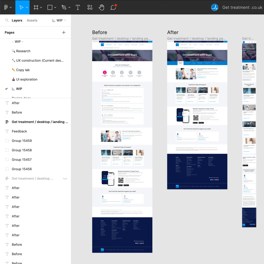
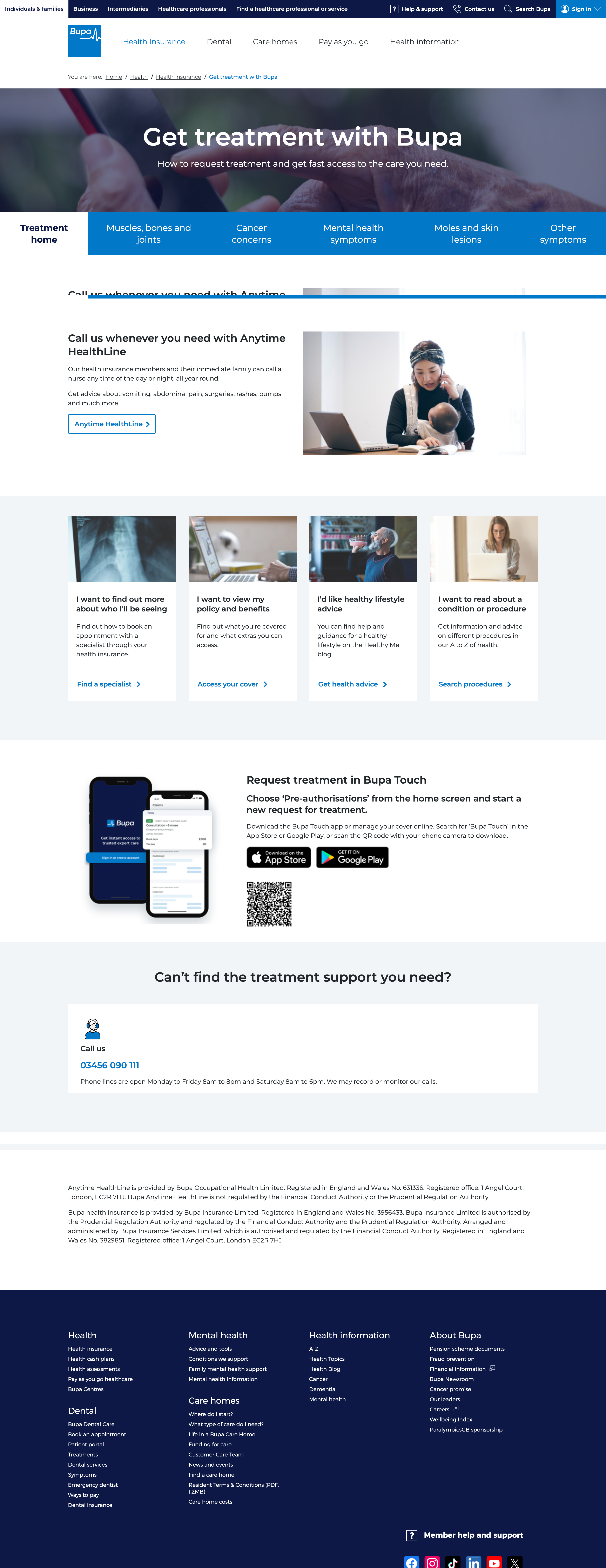
To improve consistency across the website, and save development time, we replaced the hub’s icon navigation with a tab component from the new design system. There was the added benefit of future-proofing the design, as we learned that the existing icons were about to be retired.
Other changes included reducing duplicated content, simplifying copy on CTA buttons, and replacing images for better diversity and inclusion.
Solving problems
Our biggest blocker was around the Virtual Assistant: informing users that it was a contact option, which topics it could help with, and how to start a conversation (which may result in being transferred to a real person).
Using evidence gathered from research, including competitor analysis, I was able to convince stakeholders that it was best to be clear from the beginning that the Virtual Assistant was a chatbot and not a real person.
Crits and collaboration
We designed several solutions, regularly presenting to stakeholders to explain our thought process, reasons for proposed solutions, and to invite feedback and questions. We iterated the design three times, clarifying copy and changing colours to increase the use of ‘Bupa blue’, amongst other adjustments.
Once we were confident we had a ‘final’ design, I demoed it to the page owner, talking them through the journey we’d gone on to arrive at this solution and getting their sign-off to implement it.
Before and after

Summary
I’m particularly proud of the concise, easy-to-understand information and the onwards journeys for the Cancer Concerns and Mental Health Symptoms pages. Much consideration was given to users’ goals, motivations, and how they might be feeling while visiting these pages.
I left Bupa as these designs went live, but agreed next steps were to:
- Continue monitoring the pages as people interacted with them, ensuring that our changes have actually made improvements for users
- Liaise with the contact centre to gather user feedback and understand how the redesign might have affected the volume and type of incoming calls dealt with by staff
What else have I done?
See more of my work, including accessibility improvements at the Barbican Centre and using design sprints to co-design at Cancer Research UK.
