The problem
Stand Up To Cancer UK’s website needed a refreshed look and feel, to launch alongside a new marketing campaign.
For context: Stand Up To Cancer falls underneath the Cancer Research UK umbrella. It focusses on translational research and is aimed at a young audience.
The timeline
Summer to October 2018.
The team
Project team
- 1 Marketing Manager/Product Owner
- 1 Proposition Manager (now known as a Service Designer)
- 1 Developer
- 1 Tester
- 1 UI Designer
- 1 UX Designer/User Researcher (me)
Stakeholders
- Stand Up To Cancer brand marketing team, including several marketing specialists of mixed seniority
- Activity Management product team
- Online Fundraising product team
- Event Management product team
UX process
Research
To get an understanding of who our supporters were, and why they engaged with Stand Up To Cancer, I conducted in-depth user interviews. These were then used to create user personas which we referred back to throughout the design process.
Alongside this I facilitated user journey mapping sessions with key stakeholders and these were vital in identifying pain points. We used them to make assumptions that we tested later.
Google Analytics, Hotjar, and CrazyEgg allowed me to analyse how users interacted with the current website so that we could spot problems and opportunities for improvements. Additionally, I undertook competitor analysis to see what similar charities, and brands aimed at young people, were doing and how well this worked for them.
All of this work fed into ideation sessions where we came up with potential solutions to put in front of real users.
Sketching, wireframing, prototyping
Most ideation was done by hand and I sketched many ideas before transferring the strongest into Balsamiq wireframes. These were then shared with stakeholders.
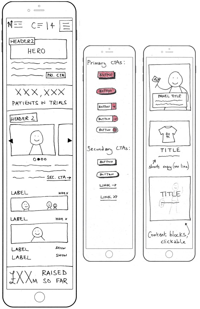
It was agreed that I should design mobile-first, because the majority of our users were on smartphones and to follow the philosophy of prioritising smaller screen sizes to create better user experiences for all device types (i.e. it’s easier to scale up than down).
Next I used Axure to create high-fidelity interactive prototypes, which we took to usability testing.
User testing
Usability testing took place in a lab, where we could observe how participants used the prototype while also noting their facial expressions and tone of voice.
When filling in the participant brief I’d prioritised younger folks to align with the target audience, but also requested people who fit into typical Cancer Research UK demographics so we could check that we weren’t alienating our valued usual supporters.
We took notes while observing and recording participants, then asked them to complete the System Usability Scale and feedback form. We also scored participants’ on a scale of 0 to 3 to indicate at a glance how easily they’d been able to complete the tasks we’d set. For example, if they wanted to make a donation might they use the menu or the new sticky/floating action button we’d introduced?
This all gave us useful insight into what worked well and what needed continued iteratation.
There was then a second round of user testing, with different participants, to ensure that the changes we’d made did in fact work better for users.
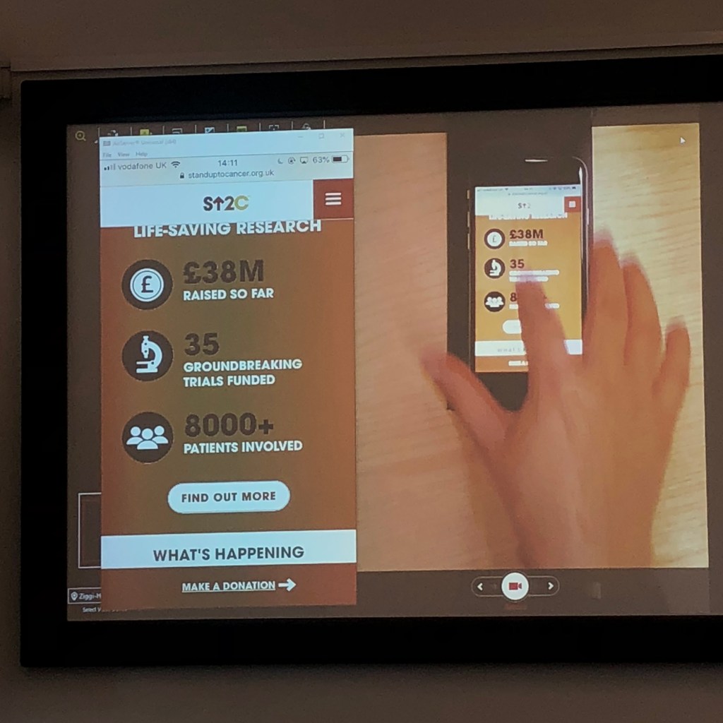
Finally the designs were ready for development. They went live in time for the new campaign, in autumn 2018.
Measuring success
Once the designs were live — and throughout the campaign — I continued to test and improve, such as by using Google Analytics to monitor engagement, and by setting up A/B tests to measure the impact of changing colours, images, and copy.
For example, using the words “Get involved” instead of “Sign up” on a fundraising call-to-action button resulted in a huge increase in people both interacting with the button and going on to submit the form/register to fundraise.
We also experimented with donation nudges, to find the sweet spot in encouraging people to make larger one-off donations without alienating those who could only give smaller amounts.
Summary
This was a really challenging but fun project, where I educated stakeholders about human-centred design while also working on improving the website. For example, I taught them how to write discussion guides for interview users and user testing, how to create basic prototypes, and how to set up and monitor multi-variate tests using Optimizely.
We later noticed that the website for Stand Up To Cancer USA had been re-designed to look very similar to our UK site — further evidence that the design looked great as well as offering users an improved experience.
What else have I done?
See more of my work, including improving accessibility at the Barbican Centre and making it easier for Bupa customers to access healthcare.
